“You never get a second chance at a first impression”. Successful companies build brands that attract the right customers and inspire them to become loyal fans and purchasers. Your logo is a significant part of the first impression that your business will make, so you want to make sure it’s done well. Creating a logo is a great opportunity for you to define and express your brand’s personality, culture and values.
Most startups do not have marketing budgets which would allow them to hire a design firm. However, it is possible for them follow a few important steps and create a standout, professional logo at an affordable cost. Before starting the design process, it’s important to think strategically.
1. Define your brand identity. Understand the core value and personality of your company because this will influence the look and feel of your logo. What do we do better than anyone else? What are the values that are important to us as a company? Why did we start this business?
2. Think like your audience. While it’s important that you like your own logo, it’s arguably more important that your target audience relates to your logo. What’s important to them? How do you want them to perceive your logo?
3. Research the competition and look for inspiration. Take a look at the two candle companies below. You can infer a lot about the product and company culture by looking at these logos: one product appears luxurious with the shiny gold coloring, foreign language name, and regal icon. The other seems to be a small business that cares about the source of the wax material (from the bees), is probably handmade, and has a fun and lighter personality with the name. How do you want your logo to come across?


Next, you need to make some tactical decisions.
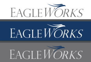
4. Colors. It is recommended to use only two colors for your logo. When your logo is printed on any materials – paper, shirts, mugs, business cards, etc. – there is often a screen charge per color. You should choose colors that reflect your brand’s personality. Color psychology is very important; colors provoke different emotions and ideas. Try out this online brand color generator tool. Also, make sure the logo will look good as an all white design against a dark background.

5. Typography/fonts. In addition to color, fonts also significantly represent brand personality. Serif fonts have little “feet” at the end of the letters which makes logos look more chic, timeless, elegant and vintage. Sans serif fonts (without “feet”) are more modern, sleek and clean.
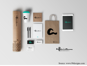
6. Less is more. Sometimes, clients want to incorporate every message, value and meaning of their business name into their logo. Or, they feel inspired by a story that’s reflected in the logo. Look back to step #2 in designing a logo: think like your audience. Most often, these complicated logos look unprofessional and don’t effectively portray your brand. Strong logos are recognizable, easy to remember, and inspire trust. They can be printed in black and white, at any size, and printed on many different materials without losing their distinction. See below:

7. Assess. Once you finish prototyping your logo design by hand or digitally, ask yourself these four questions:
- Is it simple?
- Is it memorable?
- Is it versatile?
- Will this appeal to my target audience?
Finally, if you don’t have digital graphic design skills yourself, it’s worthwhile to pay a student, colleague, or online artist (from a freelance website like fiverr) to draw your logo originally on a graphic design software. This way, there are no potential copyright issues. Additionally, they can provide the right file types that can convert to any size and maintain high resolution quality (for an outdoor banner or a business card, for example). Lastly, it will be obvious to the audience that the logo is professional and not created on a Microsoft platform or a free logo-making online website.
If you want a professional logo consult or need help protecting your logo, reach out to our office for a free consultation at www.umw.edu/sbdc.